Unified patient page for Liva Healthcare

To avoid sharing confidential information, I will not provide all the details of this project and its process. Information visible on the user interface are not real patient data.
The Problem
Health coaches at Liva Healthcare (working with NHS, Convatec, and Novo Nordisk) were struggling with a fragmented user experience. Patient information and platform features were scattered across multiple pages, creating a cumbersome workflow with excessive clicking and window switching. During critical video consultations, coaches couldn't simultaneously access patient data while engaging with patients.
Key Pain Points:
Frequent switching between multiple browser windows during patient interactions
Difficulty accessing patient information during video calls
Interruptions in the coaching process due to lack of simultaneous access to information
Research Approach
Observational Studies: Observed five health coaches throughout their workdays to understand platform usage during patient interactions
User Journey Mapping: Documented behaviors, pain points, and emotions across key workflows like sending interventions and conducting video calls
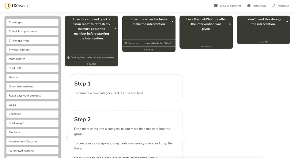
Card Sorting: Multiple exercises to understand how users naturally organize and prioritize information, including frequent actions, workflow-based sorting, and information categorization
Co-creation workshop: Facilitated design sprint with stakeholders and users.

Key User Needs Identified
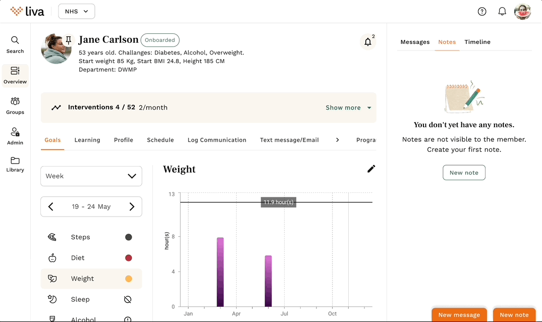
Single Patient Page: Each patient should have one comprehensive page, streamlining information access and management
Guided Administrative Flow: Structured process with guided flow for smoother task completion
Integrated Video Viewing: Ability to view video calls while simultaneously navigating patient information
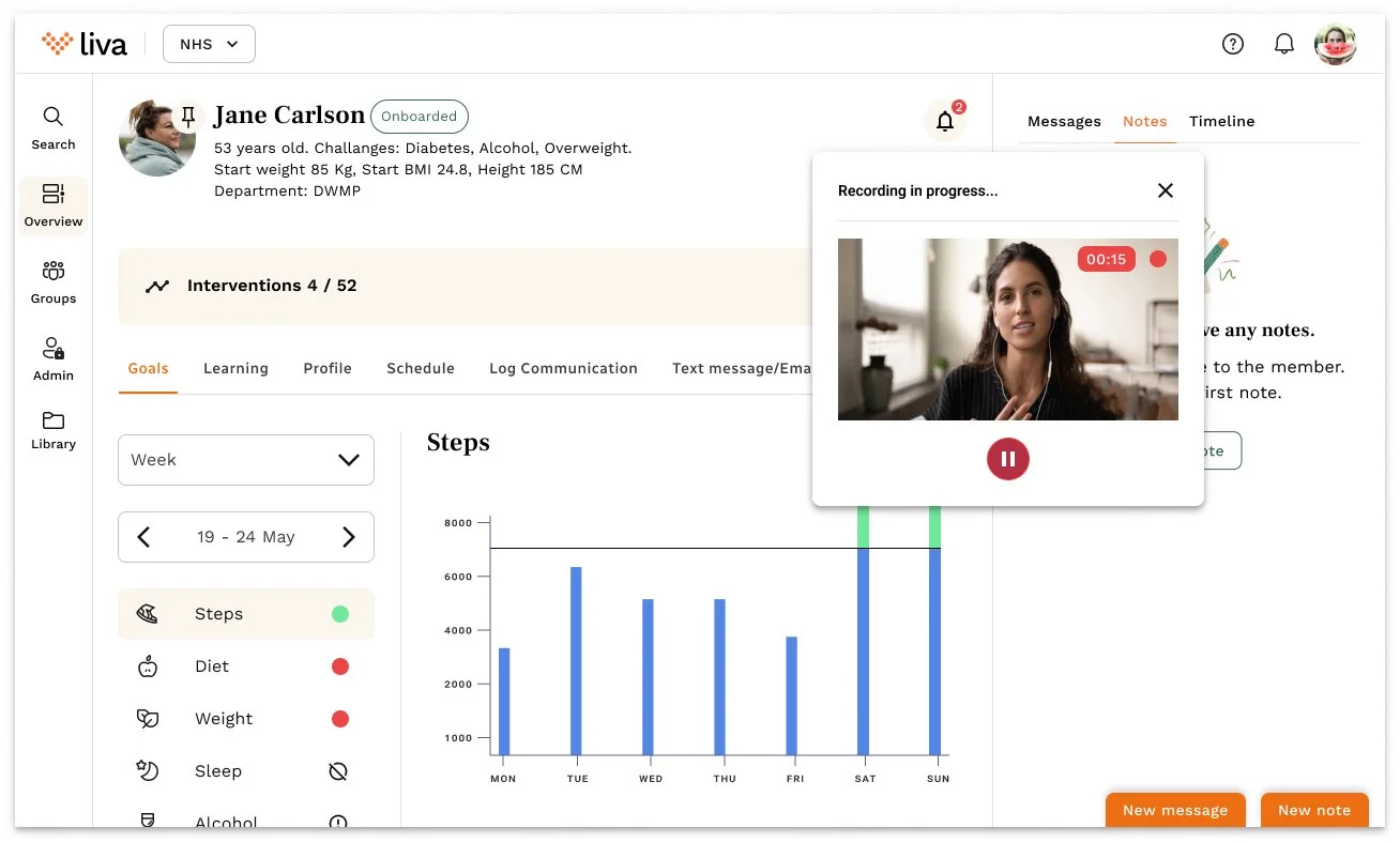
Notes Consolidation: Note entries organized into one unified place rather than spread across four different pages
Alert Transformation: Information previously displayed as alerts across pages collected in one place as notifications
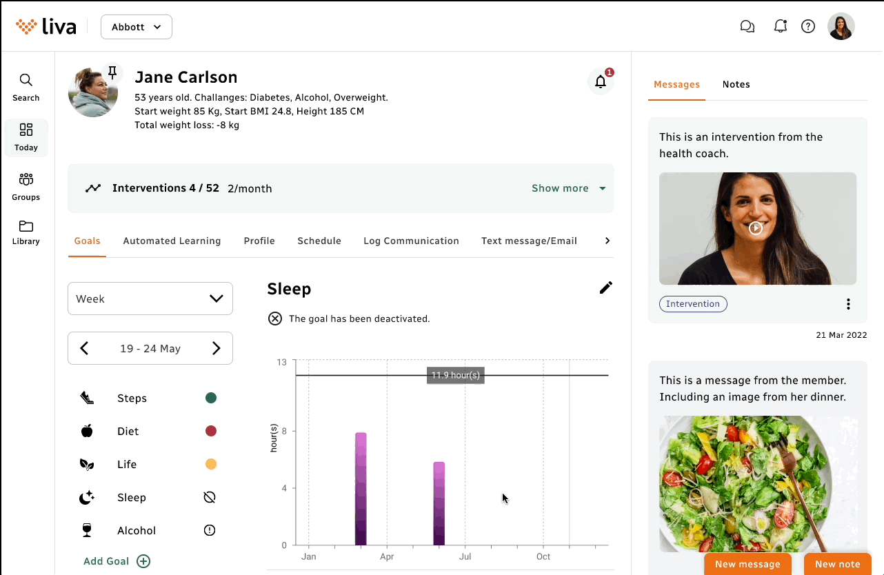
Unified Patient Profile: All patient information collected under profile section and categorized into logical groups based on card sorting
Dynamic Administrative Flow: Multiple logical pathways to dynamically present appropriate administrative flow based on backend logic and user inputs
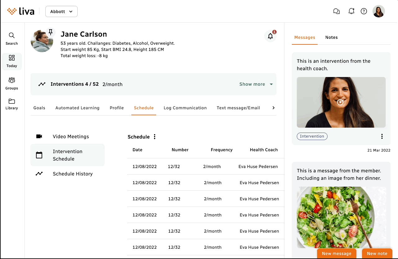
Integrated Video Calls and Video messages recording: Video call and message window opens on member page and can be moved around to access patient data meanwhile.

Results & Impact
Usability Success:
94% of coaches reported finding it easy to use
92% of coaches successfully registered video consultation outcomes using new guided flow
Efficiency Gains:
Administrative tasks reduced by 10 minutes (measured through behavioral analytics)
Key Takeaway
This case study demonstrates how observational research can uncover workflow inefficiencies that users have adapted to but significantly impact their productivity. By consolidating scattered information into a single, well-organized interface, the design reduced cognitive load and improved task completion rates for health coaches managing chronic disease patients.