Unlocking User Engagement in mHealth Applications: Opportunities of AI for Personalized Health Solutions
The rise of chronic diseases poses a staggering public health crisis, particularly in the UK. Cardiovascular disease remains the leading cause of mortality, responsible for approximately 169,000 deaths each year—one in four total deaths (British Heart Foundation, 2020). Meanwhile, about 4.9 million people live with diabetes, a figure that has surged in recent years (NHS Digital, 2021). Managing diabetes alone costs the NHS approximately £10 billion annually , illustrating the substantial healthcare burden of chronic illnesses (Diabetes UK, 2021).
Recognizing this escalating crisis, governments and health organizations, including the NHS, see mHealth applications as vital tools for engaging patients, promoting healthier lifestyles, and reducing healthcare costs. However, this potential is often undermined by the reality that patients are referred to use digital tools, only to find themselves dropping out of interventions shortly after initial use. Research indicates that up to 98% of users may disengage after a brief period (Meyerowitz-Katz et al., 2020). This project aims to address these challenges through an applied design initiative focused on enhancing user experience within an mHealth application developed by a Danish technology company.


Understanding User Needs: Methodology
The study utilized a qualitative research methodology, beginning with in-depth user interviews to gather insights into user experiences. I analyzed a total of twenty semi-structured interviews with existing users of the mHealth app between 2021 and 2022. Each interview lasted approximately 30-60 minutes, providing a platform to explore users' motivations, challenges, and overall satisfaction with the application.
Following the interviews, the collected data underwent thematic analysis, revealing key findings related to user engagement. Additionally, a literature review was performed to contextualize these findings within existing frameworks of Behavior Change Design, specifically the Behavior Change Wheel developed by Susan Michie. This framework helps identify barriers to behavior change, allowing for the design of tailored interventions that can effectively address user-specific challenges.


Key findings
The results from the user interviews highlighted pressing issues affecting user engagement:
Disengagement Factors : Users frequently cited infrequent health coach feedback and a lack of personalized interactions as significant barriers to sustained app usage. Many expressed frustration over insufficient motivational features that left them feeling unsupported.
Desired Features : Participants indicated a strong demand for immediate feedback and more interactive elements within the app. More frequent interventions, personalized for them.
User journey map
To analyse the research findings effectively, I developed a user journey map structured around key workflows, such as sending interventions to patients or engaging in video calls with them. This map documents their behaviours, pain points, verbal expressions, and emotions throughout these processes. While it's important to acknowledge that not all issues have been resolved due to limitations and time constraints, the maps serve as invaluable tools for designers and teams. They allow us to perceive problems as part of a larger system and facilitate the process of breaking them down into manageable steps.

Translating research findings into user needs.
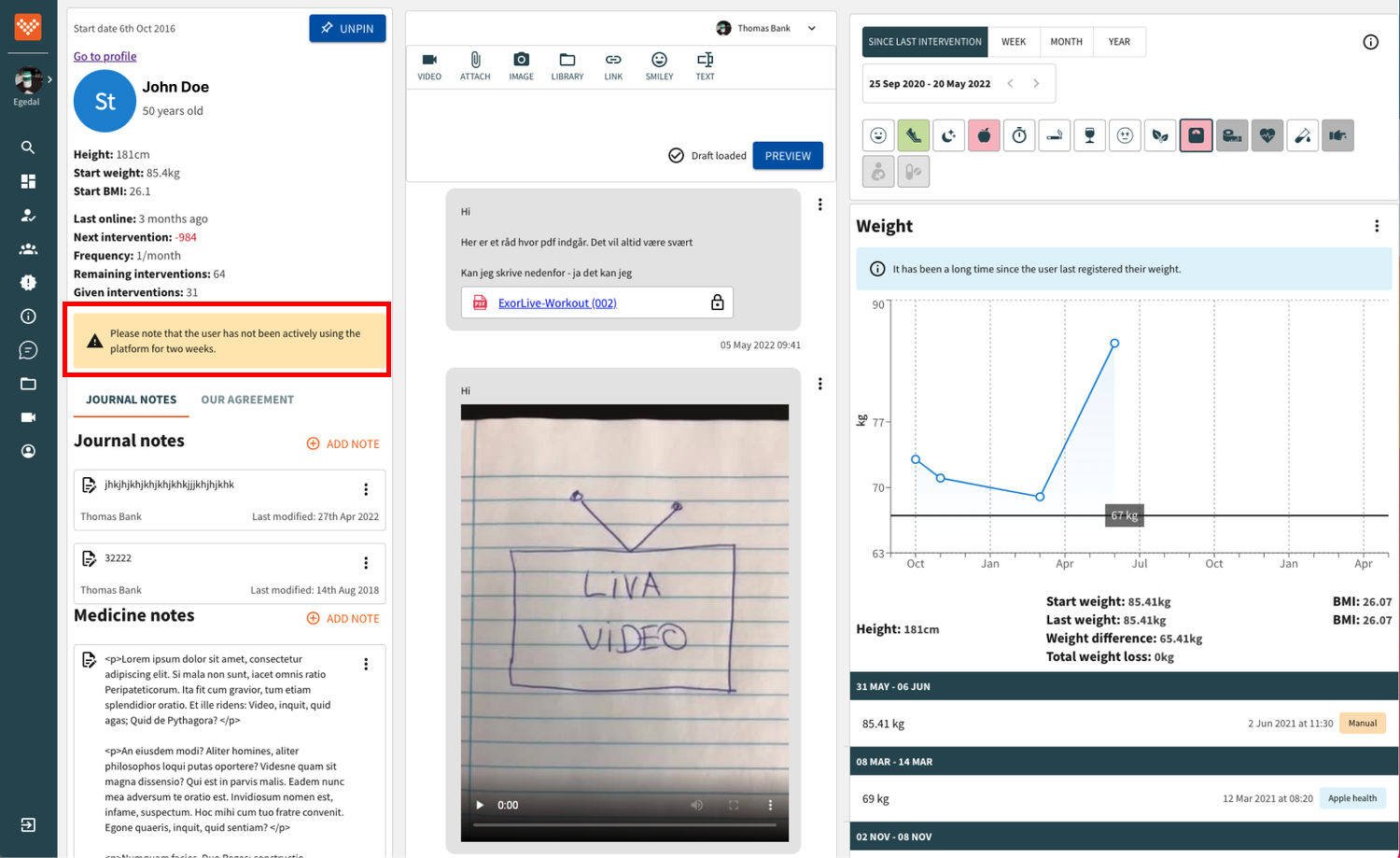
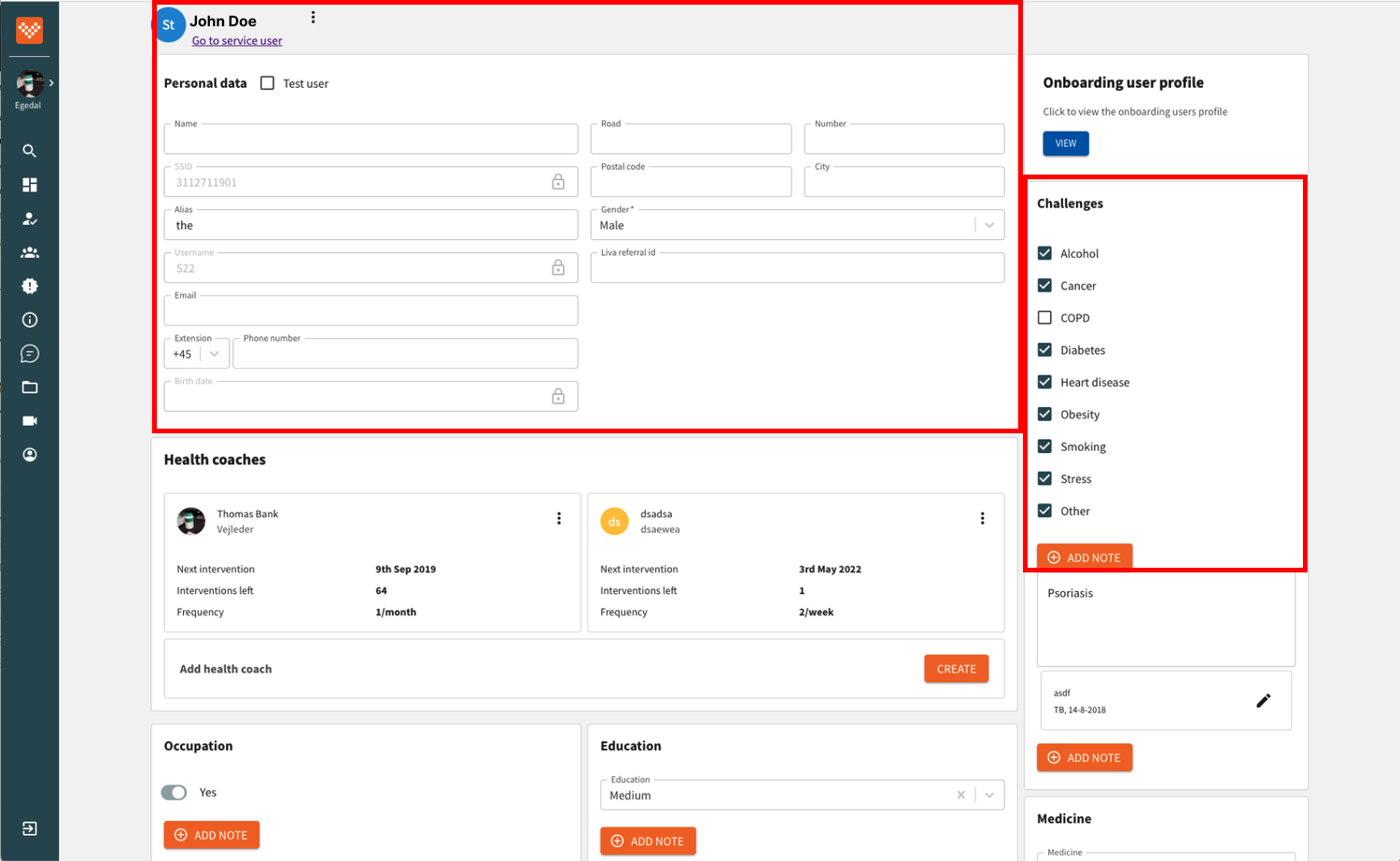
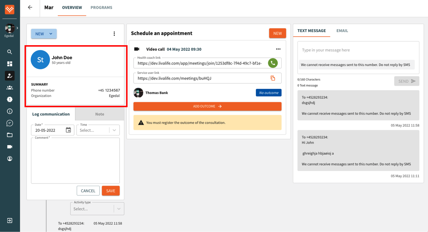
1. One Patient Page: Each patient should have a single, comprehensive patient page, streamlining information access and management.
2. Guided Administrative Flow: The administration process should be structured with a guided flow, facilitating smoother and more efficient completion of tasks.
3. Integrated Video Call Viewing: Health coaches should be able to view the video call with the patient while simultaneously navigating the patient page, enhancing their ability to engage effectively during sessions.
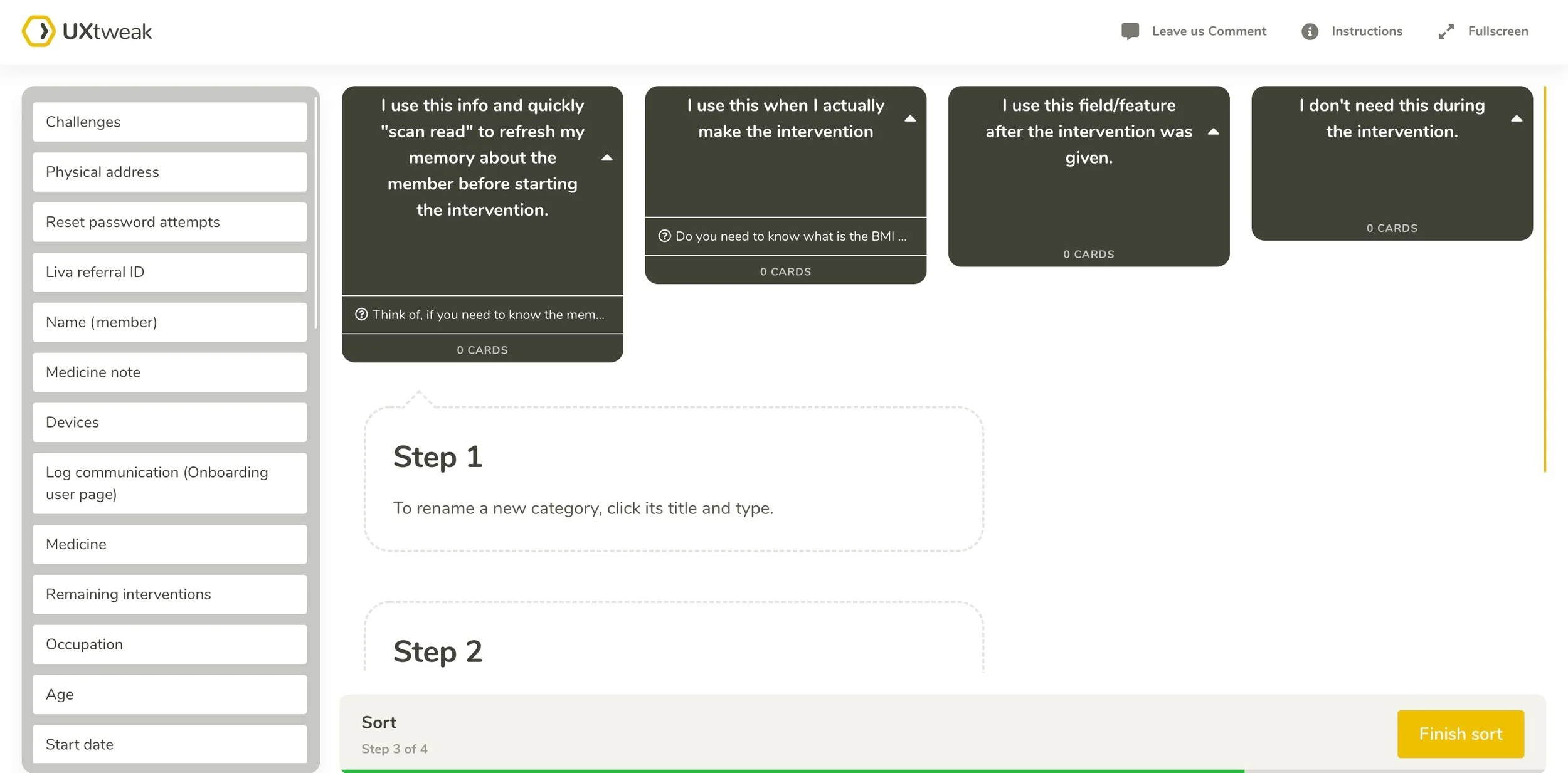
Card Sorting
Through multiple card sorting exercises, I gained valuable insights into how users naturally organise and prioritise information.
How do users prioritise frequent actions?
How do users sort information based on different workflows?
How do users group large amounts of information into categories?
What information do users not need?
User Testing
The design went through different versions based on user feedback, which I will not detail in this case study.
Final design
Notes Feature
The note entries and written notes are organised into one unified place rather than spread across four different pages. It's easy to access and switch between different note types.


Alerts turned into reminders
The information the coach should remember was displayed as alerts across the pages. In the new design, these alerts are collected in one place as notifications.
Compare it with the previous design

Patient information in one profile section
Based on card sorting with users, all information was collected under the profile section and categorized into logical groups.

Administration Flow
I identified multiple logical pathways to dynamically present the appropriate administrative flow based on the backend logic and user inputs. Because it is confidential information, the video below is just a simple presentation of the approach.
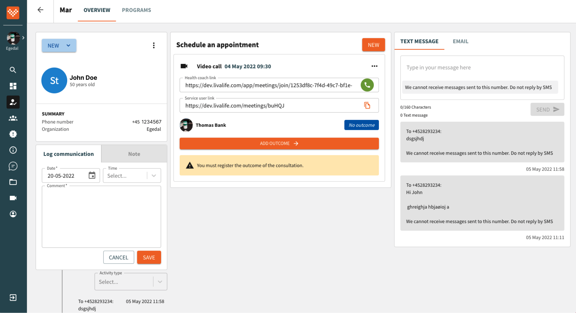
Easy access to patient data during the video call
The video call window opens on the member page and can be moved around on the page to access patient data.
Next: Increased User Engagement in the Liva app ➡️